
Featured:
At the end of every year at Nationwide Print, we take a moment to look ahead to the graphic design trends which will be filtering down to our state-of-the-art printing presses in the next 12 months. It takes a while for cutting-edge design concepts to percolate down to the level of functional print, but we are already quite excited by what we see. We’re looking forward to watching colour gradients, playful illustrations, sophisticated typography and organic shapes flowing off our presses in 2020.
Plus, there is a strong environmental leaning to design this year, which we’re pretty thrilled about given our own green credentials. Nature is big for 2020, as brand managers and lead creatives seek to emphasize environmental credentials and appeal to young audiences. In the face of growing alarm about the state of the climate, and the impact of technology on society, reconnecting with nature is becoming a major preoccupation and design is increasingly reflecting that.
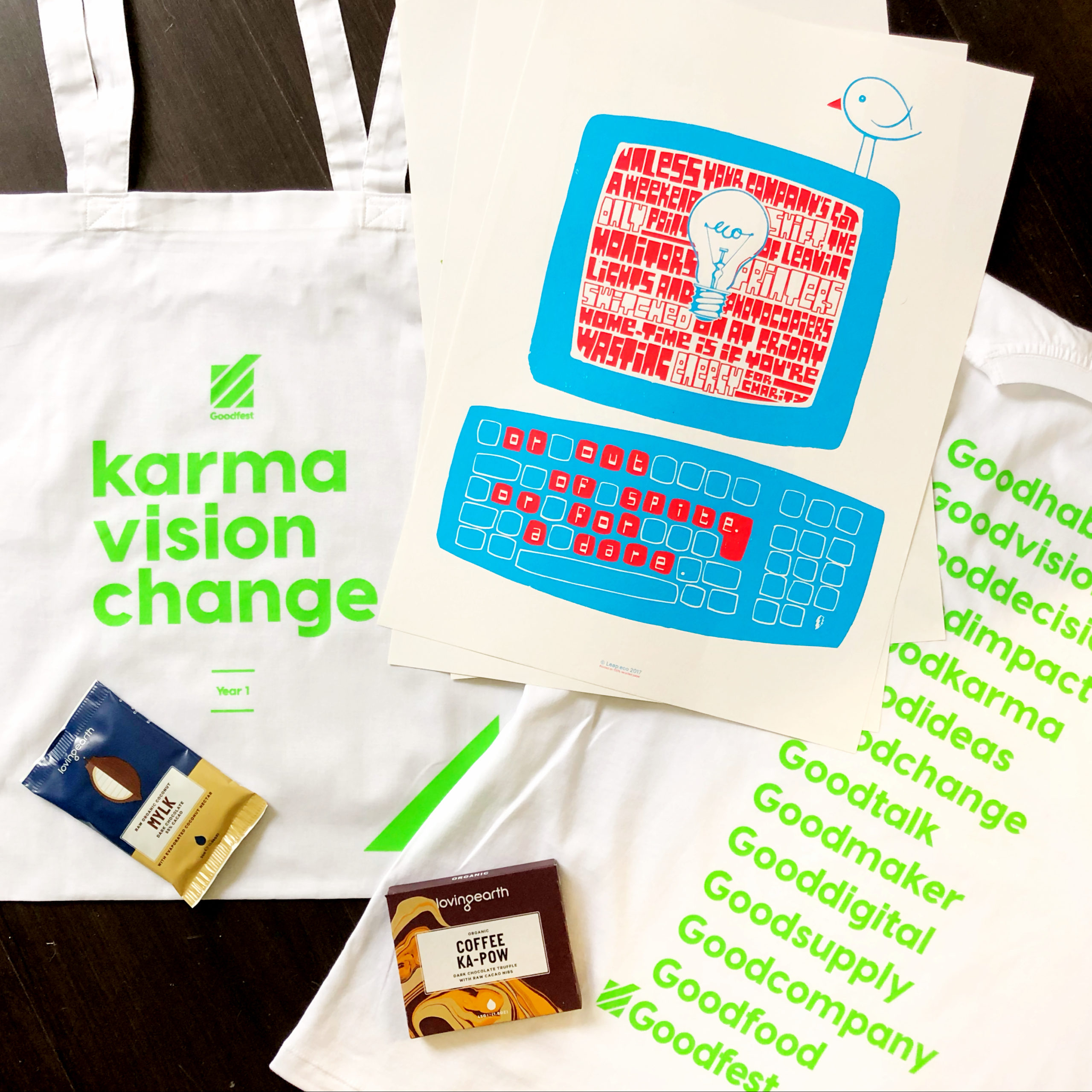
If you’d like to dive into this new world order yourself, check out our friends at Leap. We are proud to work with this B Corp Certified ‘design for change’ agency on a regular basis, creating a low-impact feedback loop for businesses who put the environment first.
We know from past experience that some hotly tipped trends will catch on and others won’t, so we have selected those that we think have both style and substance. So, why not take a moment to digest these creative concepts and reflect on how you might incorporate them into your communications strategy in the year ahead? Then get in touch, we’d love to help!
- Colour Trends
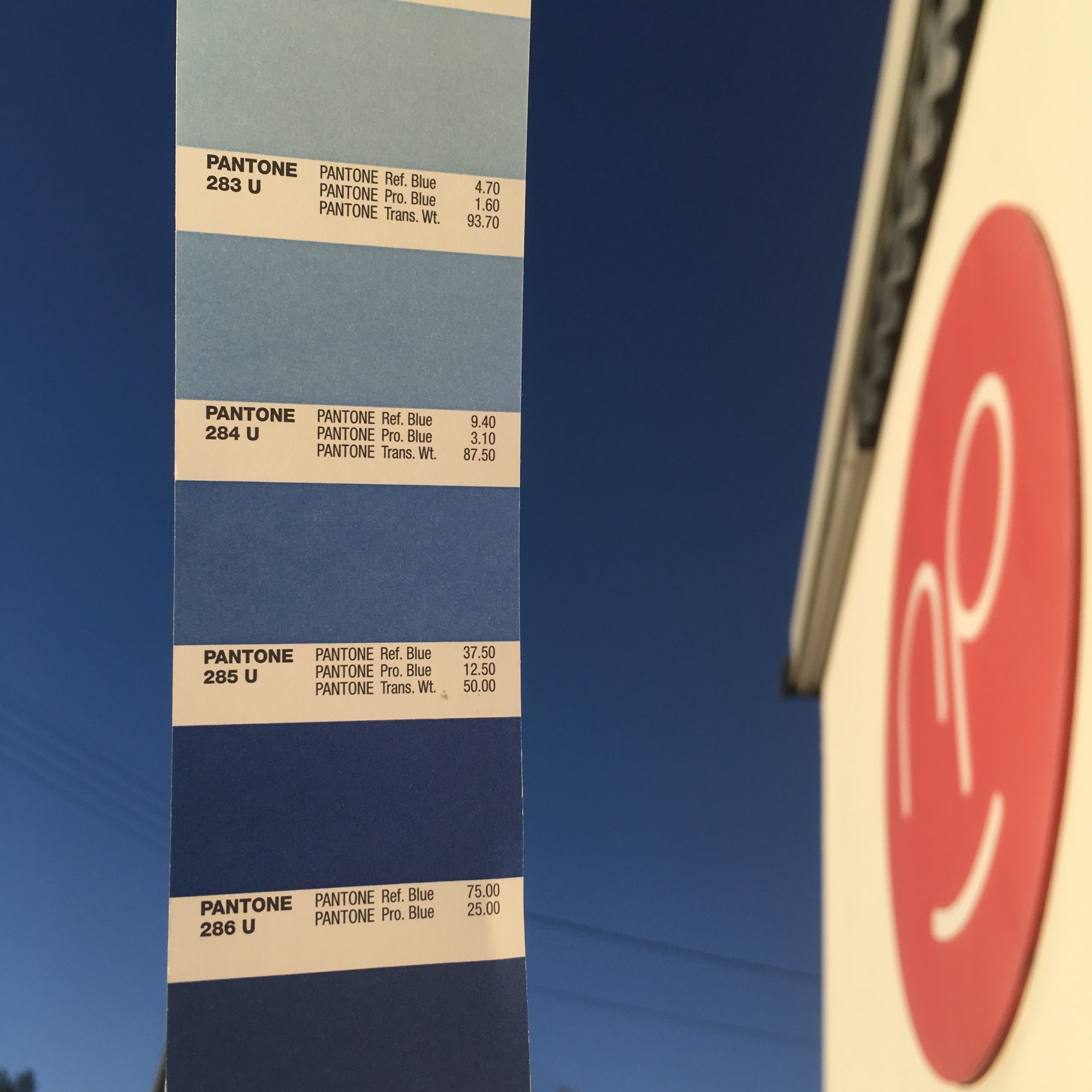
For some clients we’re seeing a return to muted, harmonious tones and natural imagery (lots of brands are using striking stock images which celebrate nature at its most remote and majestic). However, others are reveling in the vibrant application of bright colour they are able to achieve with our print technology, pairing this with a minimal design feel. Talking of palate, Dulux have helpfully come up with an antidote to our “increasingly disconnected” world in the calming hazy green tones of ‘Tranquil Dawn’, their Colour of the Year for 2020. Australian creative duo Jack & Huei went a step further, hijacking Pantone’s annual Colour of the Year announcement to make a statement about the impact of the environmental crisis on the coral reef: last year Pantone choose Living Coral, and ‘Bleached Coral’ (a very pale blue shade, which matches the colour of dead coral) was the natural repost. Pantone in the end went for ‘Classic Blue’, a reassuringly familiar colour at the start of a new, probably very turbulent, decade.
- Imaginative Illustrations
Against this background of a muted – or sometimes monochrome – palate, clever illustrations and unexpected interactions between graphic elements will really stand out. Illustrators and designers are opting for abstract storytelling and dream-like scenarios to help us step off the page or screen into the world of our imaginations. Think a mash-up of artists like Dali and Esher, but more light-hearted! This simple, child-like take on the world again reflects a longing for simpler times and greater interconnectedness.
- Organic Shapes and Flowing Lines
These design elements are already filtering through into the print campaigns of some of our biggest multinational clients here at Nationwide Print. Again, a return to organic forms and a softening of visual language is all reflective of appreciation for nature and a desire to signify environmental values. Simple line drawings and – in the digital world – animations, look clean and fresh and are helping marketing messages cut through the noise. Kandinsky and Miro seem to be having a revival here, and the results are awesome…

- Liquids and Colour Gradients
This trend is perhaps more relevant to the world of digital design, but nonetheless we are expecting to see some elements find their way through our presses this year. Using gentle colour gradients is an effective and simple way of livening up a flat surface. Creating liquid-look designs on paper and packaging is another eye-catching tactic, as is the trend for metallic effects used to signify luxury.
- Awesome Typography
2019 was the year of BIG letters, so big that they often left the page! This oversize trend will continue in logos, posters, websites, and packaging. One newer trend that we are also seeing emerge is drawing shapes using lines of text, creating 3D objects using text, and illustration and typography mixes. Clever stuff! Finally, tying in with the nature theme, is artistic typography. This incorporates geometric patterns, flora and fauna, and organic shapes into typology – very beautiful and definitely a trend to watch.
Matt from Leap explains: “Typography is becoming much more inventive. A recent example here at Leap is the hand-written brush fonts we’ve produced as part of a large series for a client in St Petersburg. It will be used by their team for online content.”

- Paper Cut-Outs and Collage
This is a modern take on the art of paper craft and, if done properly the results are incredible. Hand-cut layers and the playful use of shadow are being used to grab attention in the form of book jackets, magazine covers and greeting cards. “I feel the use of papercut images, collage and mixed media will evolve much further in the year ahead,” says Matt.
- Feel is also Important…
In the world of print, the feel of an asset will be just as important as the design, and an equal signifier of brand values. “We’ll see innovation in the paper market over the year, as well as designers looking to be ever-more creative with the recycled papers available,” says Matt. The use of FSC recycled paper and timber can help to alleviate the pressure of demand on sources of virgin materials, thereby helping to protects the world’s forests. The production of recycled paper also uses 28% less energy than new, and saves on landfill, waste, CO2 and wood, making it the ethical and natural choice in these times of climate crisis. Here at Nationwide Print we are FSC certified, and we also use vegetable-based inks; just one of the many environmental credentials valued by our clients (not to mention the huge solar array which powers our presses, and the electric vehicle we use for local deliveries!)
As you can see from the above, graphic design in 2020 is not just about making a loud noise and a big impression, it’s also about signifying environmental values and engaging younger audiences on different terms.
Nationwide Print MD Julian Hocking has a final word on this: “Consumers rightly care about the environment, so businesses choosing green companies for design and print should be shouting about those choices. State the materials used and the energy savings, and why you’ve chosen to design and print this way – don’t hide your green light under a bushel!”


